Dot Plots vs. Scatterplots
By: Kristin Hunter-Thomson
Are these the same? Are they different? When should we use them?
These are all great questions, so let’s dive in with some examples to help explore this more...
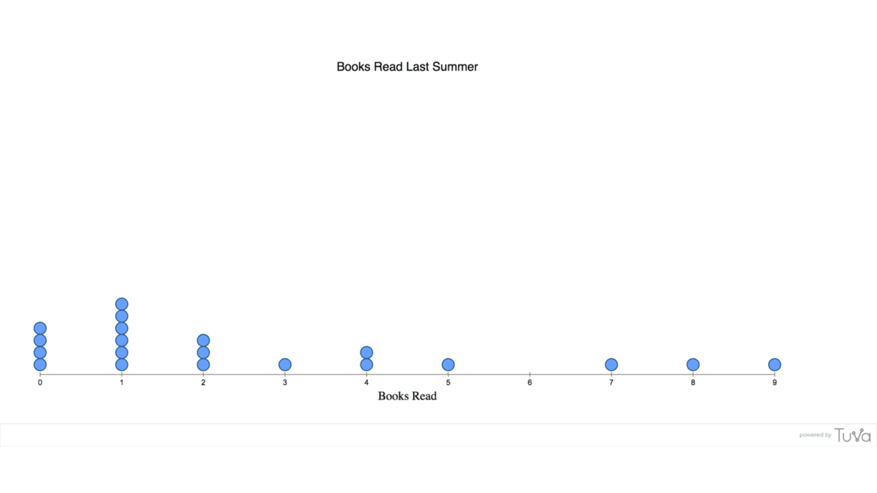
DOT PLOT / FREQUENCY DOT PLOT / HISTODOT PLOT / LINE PLOT / WILKINSON DOT PLOT / WHEAT PLOT
This one comes with lots of names, but in essence each data point represents a case of measurement as well as the measured value for an attribute (or variable). Phew, that was wordy let’s try that again with a tangible example.
If you ask all 20 students in your class how many books they read last summer and then each student gets a dot to place over the corresponding number of books they read along this number line you have now created a dot plot!

SCATTERPLOT / SCATTER PLOT CHART
This is a VERY common plot type, especially when we are looking for correlations (or over zealously wanting to state causation ;)). Each data point represents the measured value across two attributes (or variables) at the same time. This is what students are often taught how to make in math classes with (x,y) data values. But these plots appear across science, social studies, and many more fields.
Continuing with our hypothetical class, if we are interested in knowing if the number of books our students read is related to the number of pages that they read over the summer, we can make a scatterplot to investigate.
Is a dot plot the same as a scatter plot? While very similar, there is a key difference between these charts. The first only has one dimension/axis to it, while the second has two. This seems small, but it has huge ramifications for the use of these different chart types.
While scatterplots are by far more common in terms of visualizations that we see on a daily basis, there is actually far more power from the dot plot in terms of making sense of data. Wait, what?! Let’s explore this a bit more.
DOT PLOTS
Lets you visualize variability within any measured numerical attribute.
Helps you see the range of data values measured.
Helps you see the shape of all the measured data.
Helps you see the center of the measured data, via visual clumping and/or from calculating different measures of center.
Helps you gain a sense of what is typical for the attribute.
Helps you consider the precision of your data.
Helps you consider the accuracy of your data.
As in it helps your know the data you have, which is a HUGE and NECESSARY precursor to figure out what it means, etc. etc. etc.
SCATTERPLOTS
Lets you visualize a relationship between 2-3 numerical attributes.
Helps you to see if 2-3 numerical attributes correlate.
Yup, that’s it. Nothing more for this plot type :)
Dot plots are the hidden gem, or said another way the work horse, of Exploratory Data Analysis. These should the first graphs that we make almost EVERY time we work with data, at least every time we work with numerical data. In order to explore patterns, analyze patterns, interpret the patterns to make inferences, etc. we first need to know what is there in the data.
How are you using dot plots in your teaching now?
What other ways could you use them?
What lessons could you tweak so that students look at dot plots before other plots?
👉Master Graphing Course - Teach Graph Choice with Confidence
LOOKING FOR MORE?
- Join a Free Strategy Share-Out
-
Check out the Graph Type Matrix Resources for more about graphing.
-
Check out the Exploratory vs Explanatory Data Analysis mini-lecture.
-
Sign up to participate in the Data Literacy Series #2 “Create & Iterate Data Visualizations” workshop to dive into helping students think about data visualizations differently.
-
Sign up to participate in the Not Just Bar Charts: Making Better Graphs #1 “Graph Types - What are They & How Can I Make Them?” workshop to explore when to use what graphs.
