The Ultimate Guide to Choosing the Right Graph for Your Data
The most often response we hear when asking teachers “how do your students know which kind of graph to make?” is “I tell them”. No shame here! Time is limited and this is EXACTLY what we did in our classrooms too. But here is the hiccup with that always being how students know how to make graphs…we are not teaching them the skill of graph choice, or even that it is a choice.
Thus as an educator, helping our students select the right graph type is crucial for building their skills in making effective data visualization. Let’s talk through the process of choosing the ideal graph (chart, plot, or map) for your data, ensuring your students can explore the data and identify stories to tell from the data.
Understanding the Importance of Graph Selection
Selecting the appropriate graph type is more than just an aesthetic choice. It's about effectively exploring the data to make meaning, communicating data insights, and making complex information easily digestible. The “right” graph type can illuminate patterns, trends, and relationships that may otherwise stay hard to find or hidden in raw data or when we use the “wrong” graph type. Let’s dig into this as it relates to teaching K-12.
Types of Data and Corresponding Graphs
Before we explore specific graph types, let’s first review the the different types of data we often work with in our classrooms:
- Categorical Data - Information that is grouped into categories within the variable.
- Nominal: the categories are names of the subgroups that are independent of one another. For example, dogs, cats, and fish are three names of subgroups (or categories) of the nominal variable “Pets”.
- Ordinal: the categories are names of the subgroups that have a relative ordered relationship to one another. For example, we could categorize toy cars we are running down a ramp into “small, medium, or large”. These are names of the ordinal variable “Toy Car Size” but a medium car isn’t necessarily two times bigger than the small car. But it is bigger, so there is an order to the categories of “small, medium, large” but there is not a mathematical relationship. Similarly, 6th, 7th, and 8th are three names of subgroups of the ordinal variable “Grade Level” even though they are numbers.
- Numerical Data - Information that is collected as a number for the variable.
- Discrete: countable numbers that can only be specific values, often whole numbers. For example, the number of students in a class (you can’t have a half kid 🙂), number of pieces of candy, number of ladybugs on a leaf, number of straws broken by cars running down a ramp, etc.
- Continuous: measured numbers that are can be any value along a number line. For example, height of students, grams of sugar, weight of ladybugs, time it takes cars to get down the ramp.
Each data type lends itself to specific graph (chart, plot, map) types. And the most important first step when deciding on which graph type to use is to first ask “Do I want to look at/compare/consider categories or numbers?”
Let's explore the most common graph types we hear about when asking teachers what graphs their students make…and unpack a bit when to use them. As a note this is just a quick overview, if you want to learn more about advanced aspects of these different graph types (and others) check out our 3 Steps to Master Graphing short course.
Bar Graphs and Column Charts of Counts
Best for: Looking at discrete counts or values of nominal and ordinal categories
Bar graphs must have distinct categories to compare. In general, we ask a LOT of comparison questions across categories in K-12 (and in life) and thus these are versatile and relatively easy to understand. Also, we often introduce count comparisons across categories to our youngest of students…so students are comfortable working with them.

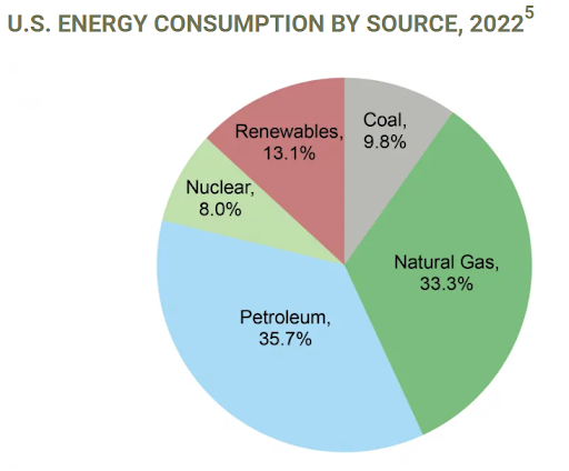
Pie Charts
Best for: Looking at nominal or ordinal categories parts of a whole
Percentages in pie charts must add up to 100% as that is the whole of the full group being looked at across the categories. So a critical aspect to remember is that pie charts do not display actual values per category, but rather how the value per category relates to the overall total of all values across all categories. Pie charts can be effective for displaying proportions when you have a limited number of categories, but get a bit trickier to make sense of when you have a LOT of categories.
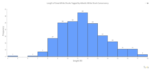
Histograms
Best for: Looking at the distribution of discrete or continuous numerical data
Histograms must have numerical data as the grouping for the bins, if it is a category then it is a bar/column chart instead. Oftentimes we collect numerical data across our trials in science or groupings in social studies. These data are IDEAL to look at in a histogram and that actually would tell us much more about the range of times it takes cars to get down a ramp or the ages of immigrants into Ellis Island than taking an average of those numerical data and making a bar graph of it. Histograms show the frequency distribution of numerical data, making them perfect for understanding data spread and getting a sense of the data overall.
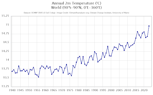
Line Graphs
Best for: Looking at continuous numerical data values when there is an order to one
Line graphs must have data over a continuous variable that has an order to it. For example, line graphs are often (but not always) used with time series data because 12:00pm has to come before 12:15pm and thus whatever was measured at 12:00pm needs to come ahead of what was measured at 12:15pm (aka there is an order to time). Another key part of line graphs is that you may not have measured anything at 12:09pm but if you had there would be a measurement…this is what the line represents (the “best” estimate of what the y-axis value would have been had you measured at that amount of the x-axis value). Therefore, it is not surprising that line graphs are especially good (and often used) to display changes over time or relationships between continuous variables.
Scatter Plots
Best for: Looking at discrete or continuous data values
Scatter plots must have numerical data from two different variables. They are thus ideal for identifying correlations or patterns between two numerical variables of discrete or continuous data. You can add a categorical variable into a scatterplot by adjusting the style of the data points (e.g., color, shape) if you also want to look at a third variable.

Decision-Making Process for Graph Selection
So what process can we use to make an informed decision of which graph (chart, plot, or map) to choose? Here are some suggestions of where to start any time you are working with data…
- Think about what you want to explore in the data…What kind of question are you asking?
- Identify what type of data you have…Is it categorical or numerical? If you have both, which are you most interested in exploring?
- Think about what comparisons or relationships you want to explore in the data…What are you looking to investigate? Ask? Explore?
- Evaluate the numbers and variables…What do you see in the data? Would a different graph type help you see it differently? As a note, if you are looking for a way to help your students answer this last question more easily? Check out our Graph Type Matrix Resource.
With these four steps you are well on your way to identifying which graph choice would work best for your data and what you are using the data for. Building the graph choice skill takes time and practice, but it is ABSOLUTELY a skill that all students can develop.
👉Master Graphing Course - Help Students Choose the Right Graph—Every Time
Common Mistakes to Avoid
Part of learning how to select what graph type to use involves having a sense of what are some common mistakes we make when selecting our graph types. Here are a few common things we often see in student work we review:
- Choosing a graph type that doesn't match the data…bar charts for every dataset anyone? There are a wide range of reasons why this happens, but just remember that often students are working from a mental model they have created (e.g., “oh we are looking at data, so I should make a bar chart”) rather than not engaging in the data work. Help students to pause and consider their data, before plowing forward on auto-pilot.
- Overcomplicating or overstuffing visualizations…just because you collected the data does NOT mean you need to graph the data. This can be hard for our students to remember, and embrace. But which parts of the data we use depends on what we want to explore in the data, sometimes we collect data to help us interpret the data, or what we see and get excited by once we have the data. Help your students realize that they need to make active choices about what to include, so that they can make the simplest graph possible to understand and communicate from their data.
- Using 3D effects…sometimes our students think that adding the bells-and-whistles of aesthetic choices is the way to make a graph look “right”. Unless the 3D effects are a critical aspect of making sense of a complex dataset in an upper level Data Science course, I would posit that there is never a place for 3D effects in K-12 data visualization. It is a distractor for all involved, including the students making sense of their data and/or how to better make sense of their data.
Case Studies: Effective Graph Selection in Action
Let's look at some real-world examples of effective graph selection:
- Population Demographics: Bar graph comparing age groups in a specific region.
- Plastic Thrown Out Each Lunch: Pie chart comparing the percentage of each number of plastics thrown out during a week from the lunch room.
- Environmental Impacts of Finches: Histogram of beak depth of Galapagos finches before and after a drought.
- Climate Change Data: Line graph showing temperature changes over time.
- Student Performance: Scatter plot relating study time to test scores.
For more on the key elements of impactful visuals, see our guide on 7 Essential Components of Effective Data Visualization.
Conclusion
Choosing the right graph type is a critical skill for learning how to make data visualizations (and how to communicate with them). By understanding your data, considering what you want to do with the data, and following best practices, you can guide your students to develop and master Graph Choice as a critical skill to graphing and working with data.
👉Master Graphing Course - Help Students Choose the Right Graph—Every Time
